What makes an appealing Logo

What makes an appealing Logo

What makes an appealing Logo
logo

Imagine brands like Nike, McDonald’s, Apple, Coca- Cola, Unilever…

When you call to mind the above brands, the first thing that comes to your mind is their Logos, which gives an idea of the importance of a Logo.

A logo is a symbol or a visual representation of your brand that helps to be recognised and remembered by your customers or audience. 

There are various types of logos-Monogram logos (or letter-marks), Word-marks (or logotypes), Pictorial marks (or logo symbols), Abstract logo marks, Mascots (Illustrated characters), Emblems.

Importance of Logo

As mentioned in the previous Blog – 5 REASONS WHY YOUR BUSINESS NEEDS A GOOD LOGO,  a good logo is essential for a brand, for the following reasons- 

  • To represent a business
  • To build customer loyalty
  • In order to establish a brand identity
  • To facilitate branding 
  • Differentiate your business from the rest 

Elaborately, a logo creates the first and a lasting impression of your brand in the eye of the beholder. As the cliched saying goes ‘The first impression is the best impression’ it creates an identity to the business, as an image, in the mind of the audience.                        It states the purpose of your business- although the logo is only a symbol it has more power to it as it represents your brand and becomes a part of your brand identity.             A unique logo helps your brand to differ from that of your competitors and helps the customers recognise your brand and If the customer is able to build familiarity around the brand, it is more likely for them to become a loyal customer.

Constituents of an appealing Logo 

A great logo is a combination of creativity, simplicity and significance. It also largely depends on the technical aspects like shape, colour and font.

Most important intention is to create the core message in a logo which is possible only if the above properties go hand in hand. 

Importance of  colour and shape in logo designing

Colour is a tricky concept in terms of the psychological aspect. Colours have different meanings in different Society. You should make sure to do detailed research before choosing one. For instance, Red can mean love as well as danger, Black- power and death, etc. 

Minimal colour on the logo can be a boon! Not more than two colours should be used for a logo as it can be difficult for the viewers to remember or recall. 

The logo colours can also be used for your entire branding strategy which can help the customers associate the colour with your brand.

In a logo, each letter form is carefully designed in detail to fit a shape to get the finest of details right. 

The use of Golden Ratio is a very popular technique in Logo designing. The Golden Ratio is a number (1.618) also called Phi that helps you create beautiful, perfectly balanced design. Apple, Pepsi and Twitter logos are a few examples of this technique.

Creativity is the Essence

Creativity is the key to designing an appealing Logo. It plays a crucial role in brand recognition.  It involves all the above mentioned aspects and more, including Creative elements that can help the logo connect with the brand and its viewers and aim to make it unique and enduring. 

Logos with multi-lingual characters to add some regional essence to it – 

Example- Logo of ‘Big 10’BMTC busses is also spelt in Kannada, the regional language of Karnataka which is visible in a 45º angle perspective.

Creativity shouldn’t confuse the viewers, instead be simple and appealing to the viewer so that it is pleasing to the eye and easier to remember. It should consist not more than 2 or 3 agreeing colours with minimal design components. 

Example of a simple Logo:

Dunzo

The delivery app Dunzo has a Black on green logo, the letter D in black with a lightning symbol in green which means fast and efficient delivery.

An example of a logo that could confuse the viewers:

Yulu

The prior Logo of  Yulu came out to be a confusing logo for a lot of viewers. It portrays a cycle with the company’s name and a curve representing the cycle wheels prior to the name which looked like the letter ‘c’. Since a lot of people were not familiar with the startup, the name was easily mistaken.

At present Yulu has adapted to a new logo.

The Fablesquare  team have designed a handful of  successful creative Logos for their clients among which, a few are mentioned below :

Privera

PRIVERA by Tech Mahindra is a global privacy ecosystem. It protects the individual’s right to privacy, consent and grievance redressal across multiple industries, including health care, financial services, retail and government. 

Use of details on the Logo like the shackle, human fingerprint, the shield, stars lining the bottom of the shield, etc work on representing Privera’s objective – Data security.

The colour blue used in the logo creates a sense of security while showing loyalty and professionalism towards the customer.

1

Khadi Nation 

The elements on the Logo are thoughtfully put together to form an essential meaning of the Brand – A clothing line that has enabled thousands of weavers with their sustenance.

The Logo represents a wheel / Charaka of hands spinning thread.  There are 24 hands in total, the hands represent the weavers, 24 (strokes) is a tribute to the Indian heritage.

2

Nexverx

An IoT solutions company with products in the automobile space, the logo was typography with colours used according to the client’s preference. The logo denotes Transmission and Reception by connecting the two‘X’s in Nexverx. The thought behind the logo is fluid communication between the sender and the receiver.

Bug snap

The logo of Bug snap easily gives away the specific purpose of the product – to eliminate Bugs. The letter ‘g’ is designed to look like a bug and the word snap is enclosed in an arrow pointed at the bug indicating that the product kills bugs. 

3

Conclusion

Logos are the face of a brand or an entity, a good logo forms an identity and helps with customer trust and reliability. A logo should be able to stick with the brand for a long time so that people can grow comfortable with it through time and should be able to relate it with the company as soon as they come across it. 


Creating Lasting Impressions

Creating Lasting Impressions

fable square blog illstr 1

Lasting Impressions:

Have you heard of the Von Restorff effect?
The Von Restorff effect also called the ‘isolation effect’, states that an item that “stands out like a sore thumb” is more likely to be remembered than others. In other words, we remember people, places and things that are outstandingly different.


Named after Hedwig von Restorff, a bias in favour of remembering the unusual.

For instance, the most famous structure in Italy is the Leaning Tower of Pisa, known worldwide for its unintended tilt to one side. An inadequate foundation on the ground which was too soft on one side to support the weight of the structure caused the tilt. Just imagine, it’s remembered because it’s built badly!

Imagine shopping in your neighborhood superstore, 2000 brands are trying to get your attention, so how will you buy the 20 that you need, and not end up with a lot more? To be easily remembered, or to stay on top of one’s mind, a lasting impression helps. With products it is called branding; the same rule applies to people as well. People, like brands, need to be distinct, and that is where ‘Personal Branding’ comes into play.


Successful brands stand for something, Tally for accounts, XEROX for photocopying and Bisleri for mineral water. Likewise, for people to be considered a brand, it is essential to have a point of view, some people will be against you, but there will be someone supporting your point of view. The adage “Those who stand for nothing will fall for anything” says it well.

Let’s talk about leaders; we can never imagine Mahatma Gandhi in a suit, Usha Uthap without her gorgeous silk sarees and large bindi or Dr. Kiran Bedi with long hair!
Each one of them communicates a message or a principle. Gandhi stood for ‘non-violence.’ Read more about Gandhi here: Gandhi – The Master PR Practitioner.
Popular Indian director Farhan Akhtar described Usha Uthup as ‘A Rockstar in a sari’, she stands out as a pop and Indipop singer with her unique traditionally draped sari, fresh flowers in her hair & a bold, big bindi. She is an ambassador for traditional Indian values.
Dr. Kiran Bedi for her no-nonsense attitude and for bringing in a positive relationship between police and people.


Brands get built over long periods of time; it takes conscious and consistent effort.  To begin with, one can focus on identifying which aspects of

  1. His or her traits to showcase, and then go about being uniquely showcased.
  2. A couple of aspects to keep in mind to be established as a brand:
  3. Be Knowledgeable – Be a Subject Matter Expert
  4. Have a Personality – Be well dressed and carry yourself with panache
  5. Seek Publicity – Speak in industry forums, write about the subject and become a guide to your industry.

Building a brand “YOU” takes perseverance!

Gandhi – The Master PR Practitioner (Salt march PR/Dandi PR)

Gandhi – The Master PR Practitioner (Salt march PR/Dandi PR)

Mohandas Karamchand Gandhi who is hailed as the father of our nation, in my opinion, is one of the most effective PR practitioners. He was a master strategist and understood his target audience very well and crafted his communication accordingly. Although he held no office, he was able to captivate the minds of India’s millions and took control of Congress and its elite, sophisticated and cynical leadership. It was his passion, careful consideration and discipline which got him the recognition which has well sustained beyond the man himself. Below are the reasons why I think he was the ultimate PR practitioner and a Brand:

01

The Salt March

The Salt march also popularly known as the Dandi March, was one of his most powerful campaign of nonviolent civil disobedience which had a massive support. The Salt Acts imposed on Indians prohibited them from collecting or selling salt. Indians were forced to buy salt which was a natural resource and a staple in the Indian diet which was needed to replace the salt lost by sweating. The British, who, in addition to exercising a monopoly over the manufacture and sale of salt, also imposed a salt tax. It contributed to almost 8.2% of the British Raj tax revenue. Gandhi, the brilliant strategist, thought that an item of daily use could resonate well with all classes of citizens of India and he chose mass civil disobedience to tackle the issue. In March 1930 Gandhi and 78 of his close associates marched from Sabarmati ashram, some 240 miles to the Arabian sea to take a pinch of salt. He informed the government well in advance about his intention to break the law to make salt. The British government threw people in jail for violating the law and censored the press. Despite that, the Media covered the event in great detail and people across the nation followed suit even though Gandhi was already in prison. Jails in India were filled with 60,000 Satyagrahis whom the British imprisoned.

SEO ESSENTIALS FOR BLOGS 44
SEO ESSENTIALS FOR BLOGS 45
02

Effective use of media

Gandhi was probably one of the greatest journalists of all time, and the publications he ran and edited were probably the greatest ones the world has known. In 1904 in South Africa, he had taken over the editorship of the ‘Indian Opinion’ and published it in English, Tamil, and Gujarati, sometimes running the press himself. He is known to have written on all subjects; he wrote simply, clearly and forcefully. His writing was passionate and burning indignation. He believed that the objective of a newspaper, is to understand the popular feeling and give expression to it; to arouse among the people certain desirable sentiments, and the third is to be fearless and to expose popular defects. He took up journalism more as a service to the public and he was devoid of any personal ambitions. He used his writing as a vehicle to present his various experiments to the public.

03

Signature style

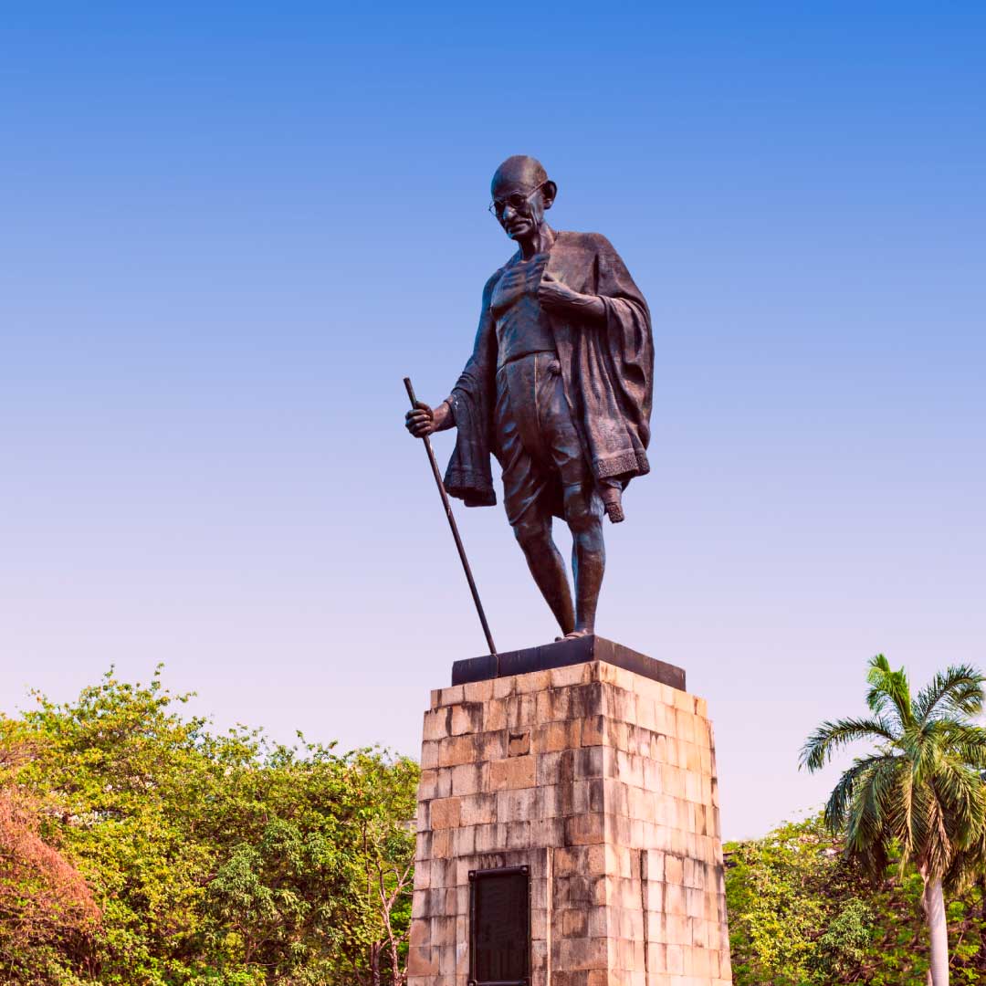
He believed in powerful symbols and designed a headgear as a symbol of Indian unity which later came to be known as the Gandhi Topi. His own dress was one of the foremost and most visible symbols he adopted–the loincloth and shawl of homespun fabric –which he deliberately chose, after careful consideration, to show solidarity with India’s grinding poverty. We all know that clothing is an important way to communicate one’s personality and not merely playing a role or dressing solely to impress. This became his trademark attire which eventually got him a name of ‘half-naked fakir’ from Sir Winston Churchill. By the time that India’s independence was won, the homespun cloth or Khadi was inextricably woven into the fabric of India’s life. Even today Khadi is the unofficial uniform of India’s political leaders.

SEO ESSENTIALS FOR BLOGS 46
SEO ESSENTIALS FOR BLOGS 47
04

Powerful Orator

Gandhi is seen as one of the world’s great inspiring public speakers. He could inspire all classes of people whether they were freedom fighters, thinkers or even the farmers. He was very articulate and considerate in expressing his thoughts. His talk was authentic and could move the whole nation into action.